
Sunday, 28 January 2018
Brimrún - week 2
Here is my homework for this week. I had a little trouble with the class one, but I'm happy with the other two.

assignment 2

Hi Charles! I tried a more conceptual approach and a more painterly render. The objecst are a wooden table, a small glass and a piece of paper folded up. Maybe i'm wrong but the shadows with a warm light appear more bluish? Thank you in advance
Saturday, 27 January 2018
Feedback: Michael's
Good rendering Mike, I feel the warm atmosphere. However I suggest the table top could be warmer to give more 'punch' to the image and your lighting looks even more intense. The red cube need more defintion for the shape. I improvised some effects here without your model. Some highlights to give more definition to the overall..
Cheers

Cheers

Friday, 26 January 2018
M. Falcone assignment
I tried to keep most of the layers separated and I attempted to blend them but I think it could be a bit better. I hope it satisfies the requirement for warm lighting, the best I could do at home was the standard yellowish light bulbs.
It was too bad I was unable to come to last class. I am looking forward to this Monday with renewed vigor!

and now 2.0

Feedback: Démie's
Tres bon rendu Démie.
About the lighting, I feel that your subject is under the daylight or cool light. I used Hue/saturation to modifie:
Blue,Green less saturated.
Red, Yellow more saturated.
Remember: Warm light enhance the warm colours but make cool colours duller
The White ( in hightlight and Light tone) is affected a lot by the lighting. In this case you should find a bit of warm colour in those areas. I used ''Selective colour'' in Image adjustment to give a touch of Yellow and Magenta in the White colour.
Thursday, 25 January 2018
Material Exercice (Week 2) Démie
Ok, I've just finished a material study and I just saw Mr Vinh's message from yesterday and what to do (precisely) for this assignment... So I might be a little off... and I'm really not sure I'll have time for more this week (I soooooo didn't want to be late in my homework this week, now I'm "too" in advance..!? :/ )
So, I wanted to experiment with light + transparency. I've always been fascinated when light crosses a transparent or translucide material and projects light inside the shadow. I'm not well set up at home with lights or making them "warm/cold" colored :/ so I though I could use some of my daughter's collection marbles: some of them are tinted. So, this is a picture I took myself, I chose the marbles and placed them with love (I actually did this last summer, in planing of this class) ;o)
So here's my painting (I made it NOT with Photoshop, but with another software called "ArtRage", which has the same base than Photoshop (layers, blending mode, etc.) but will work very closely to real traditional art medium. So here, I used the "oil" brush and "knife" (which is the "smudge / blur" tool equivalent/better) ;o)
Wednesday, 24 January 2018
Colour mixing review- Home exercise
Home exercise
Rendering of 3 objects ( in the same image or 3 images separately)of different materials: wood, shiny , glossy or matte metal, fabric, plastic, old rusty surface, leather, glass....under the warm lighting condition.
For early comments on the blog , post your works before Saturday.
The '' Colours of Rainbow'' theory


Monday, 22 January 2018
post op absence
I had a minor operation today and I thought I would be fine for class. Alas I am feeling extremely sluggish and a moderate amount of pain. I think It would be best if I rested today.
Hope you all have a great class,
Michael Falcone
Hope you all have a great class,
Michael Falcone
Week 1 - Claire


It didn't really come out how I wanted it to, and I'll probably go back and work more on it later, but here is my homework from this week. I did a picture of Eleven, from Stranger Things.


Tone Exercice: get crazy with colors (Démie's Epic Fail)
Ok
Epic fail...
Beside the fact that I totally miscalculated my time for homework in general (which I plan to fix starting now), about this exercice, I understand that I have no clue how to make this happen! D:
I understand the value part.
I understand that when I pick a color up, I can see it's value and give it a color with the same value.
I also know that from grayscale, if I change the layer propriety into "color", the gray will become colored with respect of value... but I think this is not what we are supposed to do for this exercice...
If I had planned my time better, I could have written this cry for help earlier and could maybe have had some explanations... so I feel even more stupid to be that last minute.
I just don't get how we're supposed to do this whole exercice! D:
I started with the grayscale (and I feel this might be my mistake right there), thinking/believing I would be able to put the color over it in another layer... Maybe I should have started straight with the colors!? Be even there, I have no clue how I could manage to do respectable value-map this way @_@ I feel very silly not to get this (it feels like it should be obvious).
Any how, this is what I did (I have no color at all).
Epic fail... v_v


Sunday, 21 January 2018
Shen Jia - Week 01
Had lots of fun doing this.
I think I went a bit too far with the glowing hair though. :P
Thanks again for both the class and amazing assignment!

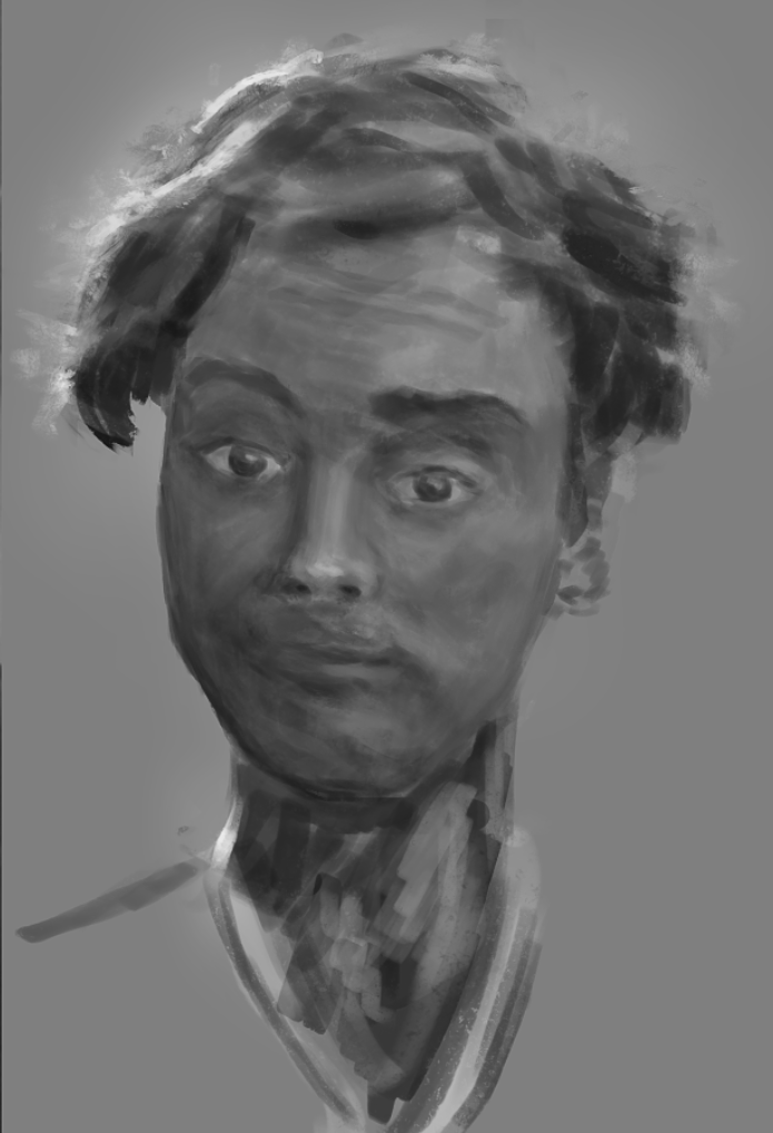


Tarik, week1, color portrait
Tried to experiment with brush strokes, bring crazy color but keeping a general coherence in the color as I would make it a portfolio piece. Not finished yet.


Saturday, 20 January 2018


Friday, 19 January 2018


Thursday, 18 January 2018


Wednesday, 17 January 2018
Feedback: Kim's
Hi Kim, good rendering of the face feature but you can get ''wild'' more,
 Don't be shy to use more strange, unusual colours for skin tone and you can do the same for the reste of the image: hair, shirt... Don't think in term of logic-the only logic here is control the right value of each colour


Tuesday, 16 January 2018
Complex colours in simple value
Hello guys, I am very pleased to see you all again this year.
Here are some samples for the approach: Complex colours in sample value. Don't hesitate to explore different , weird, exaggerate colours.... You will see that it will be a lot ''smoother'', easier when it time to go back to a more ''reasonable'' colour scheme later.


Here are some samples for the approach: Complex colours in sample value. Don't hesitate to explore different , weird, exaggerate colours.... You will see that it will be a lot ''smoother'', easier when it time to go back to a more ''reasonable'' colour scheme later.


Monday, 15 January 2018


Subscribe to:
Comments (Atom)